Heineken’s Ingenious ‘Don’t Drink This’ Campaign

 Back to articles
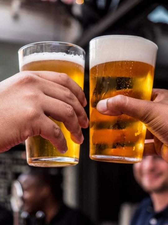
What makes a good ad? It’s an age old question, and no one seems to have the definitive answer…yet.
Whilst different ads resonate to different extents amongst viewers, there are certain metrics and scales that can create a clearer picture of how we receive ads, and what strikes a chord within us when we view them.
In this new series, we use our BEACON ad testing framework to analyse some of our favourite, and some of our least favourite, static ad examples.
Heineken’s ‘Don’t Drink This’ Campaign

One of the best performing ads tested within our database of static ads was Heinken’s ‘Don’t Drink This’. Why?
- Succinct and direct
- Eye-catching copy,
- Smart reverse psychology.
With the above, the ad drew people in with a responsible, anti-drink-driving message. This resulted in a ‘convincing’, ‘better quality’ ad that ‘gets people talking’ more than any other that we’ve tested.
The ad was also product-focused, pulling on system-1 mechanics to trigger craving in a more conventional way. This approach makes it more memorable, interesting, and thought-provoking than most other ads in our database.
The green colour scheme offers natural synergy with the product and brand, ensuring it is more clearly branded than others tested. With the product emerging as such a strong driver of clarity, can Heineken lay claim to ‘owning’ the green beer bottle as a distinctive brand asset better than anyone else?
Below you can see how our BEACON system can be used to breakdown the mechanics of success in ad content.
B – Building Brand Associations: 97% correctly identified the ad as for Heineken, and 86% felt the branding was ‘very clear’.
E – Stir Emotions and Engage: Clearly one of the most liked ads generally (58% either liked or loved), and seen as the most interesting (56%) and thought provoking (59%). Effusive reflections on why people like the ad highlight this further:
- It is clearly for an alcoholic drink and whilst promoting the product it was great to see them advising people not to drink and drive
- I love the fact that they are advertising in a really responsible way
- Love the strapline really easy to understand and comply to. The colour is obviously Heineken
A – Grab Attention: Seen as one of the most memorable (56%) and clearest (76%) ads that we have tested, the bold ‘don’t drink this’ quickly draws people in and piques curiosity alongside Heineken’s distinctive brand assets, whilst the actual the message remains to digest within the full context of the ad
Be Credible: Seen as one of the most convincing (76%), relatable (55%), and highest quality (55%) ads that we have tested, and believable that will make them trust the brand (63%), rather than a disingenuous marketing ploy.
O – Inspire Optimism: Considered an ad that will ‘get people talking’ (61%), viewers felt the responsible message and tone taken by Heineken offered something that will be able to generate social currency and positive buzz
N – Nail the message: with such a bold, direct message used in the copy the ad leaves no room for misinterpretation – despite not deploying any overtly sales-y messaging the product remains front and centre and is likely to work more subliminally as a sales tactic.
A roaring success from Heinken. With our BEACON metric, ad content of all types can be broken down and understood better than ever before. Ready to put yours to the test?

Leisure & Travel

Escape to experience: how travel motivation is changing in 2026
FMCG
A new appetite: How FMCG brands can innovate for the GLP-1 consumer

Financial Services
Where confidence turns into doubt: how the first click shapes investment journeys and why decisions pause at the point of action.

Insight